Product photo A/B testing turns visual decisions into measurable revenue decisions. If you choose images by taste alone, every weak main image can waste ad spend, bury a listing, and make a strong product look average. This guide shows how to test photos with a simple system, then use Pixora to create consistent variants without booking another shoot.
Product photo A/B testing compares two or more image versions to learn which one drives better business outcomes. The outcome might be click-through rate on a category page, add-to-cart rate on a product page, conversion rate from ads, or return rate after purchase. The point is simple: stop debating opinions and let buyer behavior decide.
A useful test changes one meaningful visual variable at a time. You might compare a pure white main image against a soft shadow studio image, or a clean tabletop shot against a lifestyle scene. If you change the angle, background, crop, props, and copy all at once, you may see a winner but you will not know why it won.
This is where many small stores lose money quietly. They spend weeks choosing the image that looks nicest to the founder, then run paid traffic into a listing that shoppers do not trust. A better workflow treats each image like a sales asset. You create a controlled set of variants, send enough traffic to each one, and keep the image that earns the strongest signal.
Why Do Product Image Tests Matter?
Images carry the first trust signal in ecommerce. Before shoppers read specs, reviews, or shipping details, they decide whether the product feels credible. A dark phone photo can make a premium skincare bottle look like a hobby project. A cluttered background can make a handmade necklace feel cheaper than it is. A lifestyle scene that does not match the buyer's aspiration can attract clicks that never become purchases.
Testing matters because the most beautiful image is not always the highest-converting image. A minimalist white shot might win on Amazon because it feels compliant and clear. A warm lifestyle image might win on Etsy because it feels handmade and personal. A bold editorial background might win in a TikTok Shop ad because it stops the scroll faster.
The risk is not just missed upside. Weak photos create loss every day they stay live: wasted ad clicks, abandoned carts, lower marketplace ranking signals, and more returns from shoppers who expected something different. Testing gives you a way to remove that risk before you scale campaigns or refresh an entire catalog.
Which Photo Variables Should You Test First?
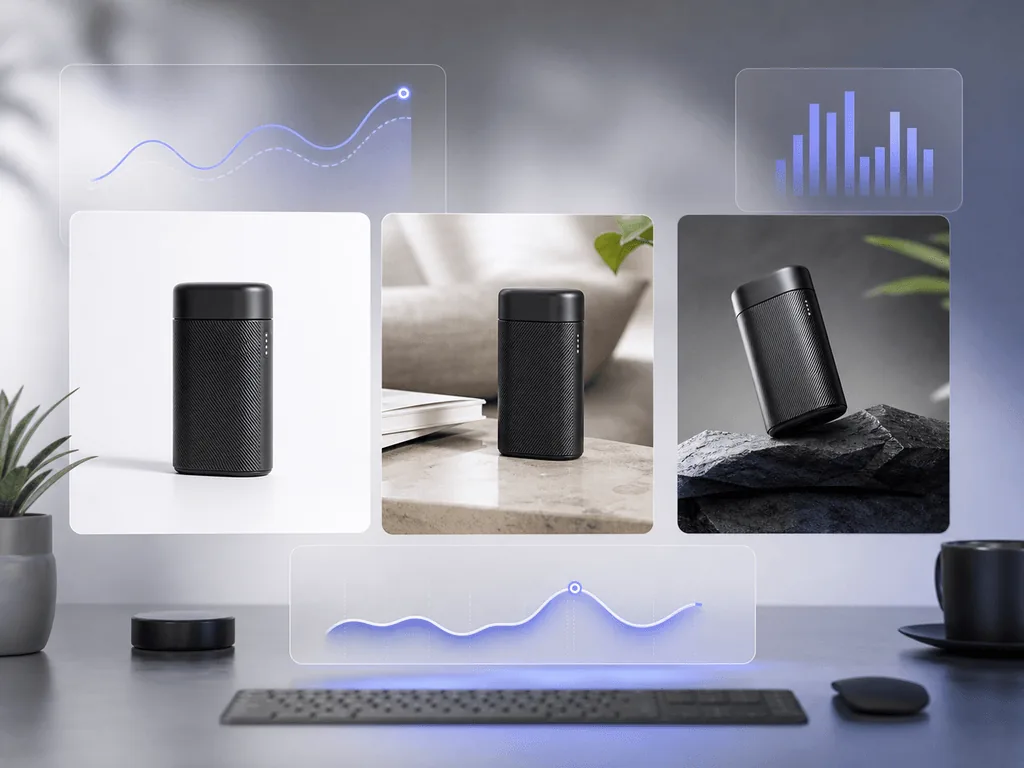
Start with variables that change buyer trust or attention, not tiny styling preferences. The highest-impact variable is usually the main image background. Test pure white, soft studio gray, and a clean contextual surface before you test small color tweaks. Next, test crop and product scale. A product that fills the frame often earns more attention, but tight crops can hide useful detail.
After that, test visual context. A kitchen appliance can be tested as a clean studio image, in a modern countertop scene, and in a usage-focused lifestyle scene. A handbag can be tested flat, on-model, and in a polished editorial setup. Each version answers a different buyer question: "What is it?", "How big is it?", and "Will it fit the life I want?"
Pixora's Smart Presets are useful here because they let you generate structured variants without learning prompt language. For example, a seller can use Fashion E-commerce Studio for a compliant main image, Accessory Still Life for a premium gallery image, and Tech Lifestyle for context-driven secondary creative. The test stays organized because each variant has a clear visual purpose.
How Do You Build a Clean Test?
A clean test starts with one hypothesis. Write it in plain language: "A lifestyle image will increase add-to-cart rate because shoppers need to imagine the product in use." That sentence protects the test from becoming a random design exercise. It tells you what to change, what to measure, and what the result should teach you.
Next, choose the test location. Category pages are good for main image click-through tests. Product pages are good for gallery order, lifestyle context, and trust-building image tests. Paid ads are good for thumbnail and scroll-stopping creative tests. Marketplace platforms are stricter, so keep compliance rules in mind before changing main images.
Then hold everything else steady. Do not change price, title, description, shipping promise, and image at the same time. If traffic is low, run the test longer or test bigger differences. A pure white shot against a lifestyle room teaches more than two nearly identical beige backgrounds. The goal is not to prove a design preference. The goal is to make a decision you can apply to dozens of SKUs with more confidence.
What Metrics Should Decide the Winner?
Pick the metric that matches the image's job. If the image appears in search results, ads, or collection pages, click-through rate is the first signal. It tells you whether the photo earns attention. If the image appears on the product page, add-to-cart rate and conversion rate matter more. They tell you whether the photo builds enough trust to move the shopper forward.
Do not ignore return rate and customer support questions. A photo that increases clicks but causes more "this looks different" returns is not a true winner. The best product image creates desire without misleading the buyer. That is why detail shots, accurate color, and honest scale cues matter.
For small stores, use directional confidence instead of waiting forever for perfect statistics. If one version consistently wins across similar products, treat it as a pattern. If the signal is mixed, segment it. Main images may need clarity, while secondary images may need emotion. Your final system can use both: a clear first image to earn trust and a richer gallery to build desire.
How Can AI Presets Speed Up Testing?
The old testing problem was production cost. To compare six photo styles, you needed a photographer, props, retouching, and time. By the time the assets were ready, the campaign window might already be gone. That reality made many small brands choose one image and hope.
AI presets change the economics. Instead of rebuilding the shoot, you can upload a clean product image, select a preset, add short notes if needed, and create controlled variations in minutes. The important word is controlled. Generic AI prompts can drift into random scenes, but preset-based workflows keep the test aligned with ecommerce needs: studio clarity, realistic shadows, consistent lighting, and platform-aware layouts.
Think of Pixora as the bridge between today's messy image library and the storefront you want customers to see. Before: one supplier photo, a few phone shots, and a brand that feels smaller than the product deserves. After: clear main images, consistent gallery variants, and seasonal campaign visuals you can test before investing more ad spend. The brand looks prepared, and the owner stops making expensive visual decisions by instinct alone.
What A/B Testing Fixes
Choosing product photos by personal taste instead of customer behavior
Spending ad budget on thumbnails that attract clicks but do not convert
Refreshing a whole catalog before knowing which visual style works
Using lifestyle scenes that look attractive but confuse shoppers about size, use, or quality
Signals Worth Tracking
CTR
Use click-through rate to judge main images, thumbnails, and ad creatives.
ATC
Use add-to-cart rate to measure product page trust and visual persuasion.
Returns
Use return reasons to catch images that oversell, distort color, or hide scale.
Create Test Variants Without a Reshoot
Use Pixora Smart Presets to generate studio, lifestyle, and seasonal image options from the same product photo.
Start with two to four variants. More versions can be useful for high-traffic stores, but small stores usually learn faster by testing a few clearly different options.
Test the main image first if traffic comes from search, category pages, or ads. Then test gallery order, lifestyle context, detail shots, and seasonal creative.
Yes, but stay inside Amazon's image rules. Use compliant white-background images for main image tests, then test lifestyle and benefit-led visuals in secondary gallery slots or A+ Content.
Run it until each version has enough traffic to show a stable direction. High-traffic ads may show a signal in days, while a low-traffic product page may need several weeks.
They can make testing more reliable when variants are controlled. Use the same product source photo, change one major visual idea, and avoid random prompt-driven changes that make the result hard to interpret.
Use Studio White Background presets for clean main image tests, Accessory Still Life or Beauty Still Life for premium gallery visuals, and lifestyle presets like Tech Lifestyle or Fashion On-Model when you want to test context and aspiration.