How to Photograph Clear Glass Products Without Losing Clarity
Clear glass packaging exposes every weakness in your setup. One dirty reflection, one vanished edge, or one muddy liquid tone can make a premium serum or fragrance look cheap. This guide shows how to keep transparent products readable, compliant, and persuasive without building a full studio.
Clear glass has almost no forgiveness. A matte pouch or cardboard box can survive average lighting, but a transparent bottle cannot. When the glass edge disappears, the buyer stops reading the image correctly. Instead of seeing clean packaging and premium finish, they see a product that feels thin, cheap, or strangely unfinished. That is a serious problem for skincare, fragrance, supplements, candles, and drinkware because the packaging is doing part of the selling.
Transparent products also make quality mistakes more expensive. Fingerprints, dust, label tilt, and liquid discoloration all become more visible because there is nowhere for them to hide. A luxury serum bottle with a cloudy highlight looks less trustworthy. A fragrance bottle with muddy reflections feels less giftable. A glass jar that blends into the background can make the actual fill level and shape look unclear. The customer may not know the technical reason, but they immediately feel uncertainty.
That uncertainty hurts commercial performance in several places. Search thumbnails become weaker because the product shape is less readable. Product pages lose persuasive power because the packaging does not look crisp enough to justify price. Ads underperform because the image does not stop the scroll. Worse, a bad glass photo can make a good product look inconsistent with the rest of the brand.
This is why clear glass product photography is not a niche craft problem. It is a trust problem. If you sell a product where transparency, purity, or premium finish matters, the image has to preserve those qualities instantly.
What Makes Transparent Packaging So Difficult to Photograph?
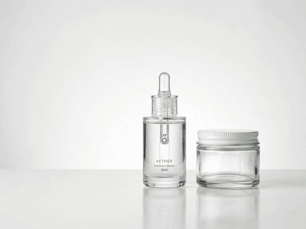
The hardest part of clear glass photography is that the product is defined by what it reflects. The viewer reads the bottle outline, neck, shoulder, and base mostly through edge contrast and highlight shape. If the environment is uncontrolled, the glass reflects random furniture, window frames, phone silhouettes, and mixed color temperatures. That noise turns a clean bottle into a confused object.
The second problem is disappearance. Clear glass on white can look elegant, but only if the edges stay visible. Without side definition, the bottle fades into the background and the label appears to float on empty space. Many sellers react by making the whole image darker, which solves one problem and creates another. The package may become readable, but it loses the bright, hygienic feel that beauty and wellness products need.
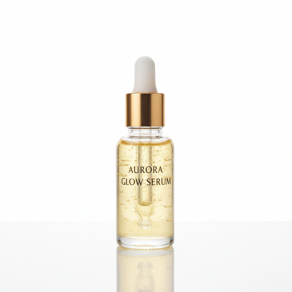
Liquid and finish create another layer of difficulty. A pale serum can shift gray or yellow if the white balance is off. Frosted glass can look chalky if the light is too flat. Glossy caps and metallic droppers may introduce hard hotspots that pull attention away from the product name. If the label is printed on transparent film, bad lighting can make it vanish entirely.
Then there is scale. A tiny travel bottle and a tall diffuser do not react to light in the same way, even when they are in the same category. That is why clear glass feels frustrating: every adjustment changes multiple things at once. Edge definition, label readability, liquid tone, and reflection control all move together.
The goal is not to remove all reflections. The goal is to replace accidental reflections with deliberate ones that describe the product clearly.
How to Shoot Clear Glass Bottles and Jars at Home
Start with cleanliness, because glass records every mistake. Wipe the bottle with a microfiber cloth, remove dust from the cap and shoulder, and straighten the label before you even think about lighting. Then build a simple set around soft, broad light. A bright window with indirect daylight works well if you diffuse it with a white curtain, tracing paper, or thin fabric. Small hard light sources create ugly hotspots on transparent surfaces, so bigger and softer is almost always better.
For the most reliable edge definition, place white diffusion behind or beside the product and use narrow dark cards just outside the frame. Those black strips create subtle edge lines that make the bottle readable without making the scene feel heavy. This is the trick that keeps a clear bottle visible on a bright background. If the glass still disappears, move the side cards slightly closer before changing everything else.
Keep the camera level and avoid aggressive wide angles. A slightly longer focal length, or simply stepping back and zooming a bit on your phone, reduces distortion and keeps vertical bottle lines straighter. Expose for the label and the glass together. If the liquid blows out, you lose product truth. If the label goes too dark, you lose conversion value.
Capture a repeatable set for every SKU: one straight hero image, one three-quarter angle, one close-up of the pump, cap, or neck, and one detail frame that shows either liquid clarity or material finish. That four-image base gives you enough coverage for listings, detail modules, and creative assets.
The discipline matters more than gear. A controlled mini set with consistent angles will outperform a bigger setup that changes every time.
What Listing Rules Matter Most for Glass Packaging?
Clear glass products still have to satisfy the same marketplace and storefront rules as other categories, but the margin for error is smaller. On Amazon and many beauty retail channels, the main image usually needs a pure white background, clear product visibility, and enough resolution for zoom. Transparent packaging makes that harder because the same lighting that preserves the bottle edge can also contaminate the background or introduce gray halos around the object.
The safest approach is to separate your image jobs. Use the first image to maximize clarity, cleanliness, and compliance. That means a true white background, visible bottle edges, readable label text, and enough space discipline that the product still feels premium when reduced to thumbnail size. Save your mood, props, and softer storytelling for secondary images where the platform gives you more freedom.
Shopify, DTC sites, and brand-owned landing pages introduce a different challenge: consistency across the catalog. If one serum bottle looks cool and blue while another looks warm and beige, the collection page feels careless. If one jar has crisp edges and another fades into white, customers assume the brand itself is inconsistent. Transparent packaging magnifies those differences more than opaque packaging does.
That is why thumbnail testing matters. Before publishing, look at the product small. Can you still read the shape? Can you tell where the liquid ends and the glass begins? Does the cap look premium instead of blown out? If not, the full-size image is probably doing less commercial work than you think.
For glass packaging, good compliance is not just about passing rules. It is about preserving readability at every stage of the buyer journey.
Before-After-Bridge: From Vanishing Bottles to a Repeatable Catalog
Before: a small skincare brand had strong formulas, clean packaging, and decent creative instincts, but the product page told a weaker story. Clear dropper bottles kept disappearing into white backgrounds. Some labels looked gray, others looked too bright, and the liquid inside each bottle shifted color from SKU to SKU. The team kept reshooting products because each launch felt like a separate lighting puzzle.
After: they stopped treating every bottle like a one-off project. The brand standardized camera height, cleaned packaging before every session, used the same soft backlight and side-card setup, and captured the same four-angle base for every SKU. The catalog began to feel more premium immediately because bottle edges, fill levels, and labels became predictable instead of inconsistent. Customers could understand the packaging faster, and the site looked more like one intentional system.
The bridge was not an expensive studio rebuild. It was a workflow that reduced guesswork after capture. Once the source photos were honest and repeatable, Pixora presets handled the output jobs more cleanly. Beauty Studio: Clean White Background gave the team compliance-safe hero images with soft highlights on glass and packaging. Beauty Creative: Aesthetic Still Life turned the same bottles into campaign-ready secondary visuals. Beauty Texture: Macro Swatch & Detail added sensory close-ups for serum and gel storytelling without requiring a separate macro shoot every time.
That combination changed the economics of launching new products. Instead of fighting edge loss and reflection chaos from scratch, the team could move from one disciplined source photo to multiple useful assets in minutes. That is the real win with clear glass: consistency that makes the brand look more expensive than the production budget.
How Pixora Fits a Clear Glass Workflow
Transparent packaging is exactly where generic AI tools become risky. They often flatten the bottle shape, blur the label, or invent reflections that make the glass feel fake. That is dangerous because buyers use packaging clarity as a shortcut for product quality. When the bottle edge looks wrong, trust drops before the customer reads a single benefit.
Pixora fits better when the job is structured. Start with Beauty Studio: Clean White Background for listing-safe hero images. That preset is designed for beauty packaging on a pure white background and is explicitly built to create soft, flattering highlights on glass, plastic, and metallic surfaces. It is the right move when you need a bottle that looks crisp, bright, and marketplace ready without writing a technical prompt for white-background lighting.
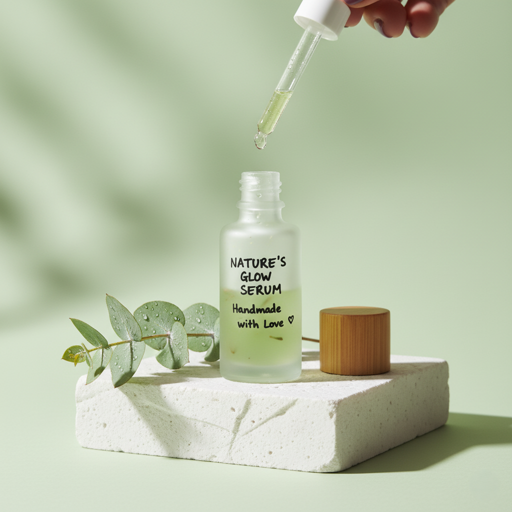
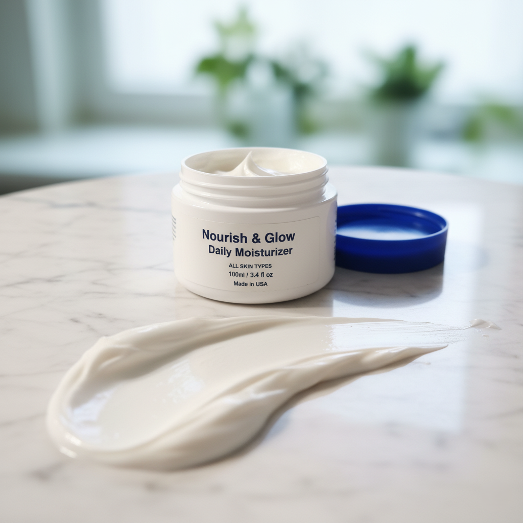
Use Beauty Creative: Aesthetic Still Life once the buyer already understands the product. It places the packaging into styled podium scenes with creative lighting, which is useful for campaign pages, social posts, and secondary gallery images where aspiration matters more than strict compliance. For formulas that benefit from sensory storytelling, Beauty Texture: Macro Swatch & Detail helps create close-detail visuals that communicate serum droplets, gel texture, or cream character alongside the packaging.
The practical benefit is not that AI replaces photography discipline. It is that a clean source photo can do more jobs. You capture the bottle honestly once, then use Smart Presets to turn that capture into compliant hero images, persuasive lifestyle frames, and texture-led detail assets. For a small team, that means fewer reshoots, faster launches, and clearer brand consistency across every transparent SKU.
Pixora is strongest here because it reduces complexity at the exact point where clear glass usually creates it.
Why Clear Glass Listings Commonly Break Down
Bottle edges disappear against white backgrounds when side definition is missing
Dust, fingerprints, and slight label tilt become far more obvious on transparent packaging
Bad white balance can turn liquids gray, yellow, or muddy even when the product is premium
One SKU may look clean while the next looks hazy, which makes the whole catalog feel inconsistent
The Glass Packaging Trade-Off
$500-$1,700+
Typical cost range for a professional product shoot before reshoots and extra variations
2048 x 2048
A common baseline for zoom-friendly product images on modern storefronts
30 sec
Typical time for a Pixora preset to generate a new listing-ready variation
Test Your Most Difficult Bottle First
Upload the clear glass SKU that usually forces a reshoot, then compare a white-background preset, an editorial still-life preset, and a texture detail preset from the same source image.
Clean the bottle, level the camera, use broad diffusion, and create subtle edge definition with dark side cards outside the frame.
A source photo where the bottle shape, label, and liquid all stay readable.
02
Separate Clarity from Aspiration
Use the main image for clean compliance and immediate understanding, then create secondary visuals that add mood, props, or texture storytelling.
Listings that satisfy platform rules without wasting the persuasive power of premium packaging.
03
Reuse the Same Source Across Asset Types
Generate a hero image, an editorial secondary image, and a detail-led texture asset from one disciplined base capture.
Faster launches and stronger visual consistency across product pages, ads, and social posts.
Pre-Publish Checklist for Clear Glass Photos
The bottle outline remains visible against the background at thumbnail size
The label text stays readable without harsh glare crossing important words
The liquid color looks believable and consistent with the real product
Fingerprints, dust, and cap misalignment are removed before final export
The main image uses a true white background if the sales channel requires it
What Improves When Glass Packaging Is Photographed Well
Transparent products look premium instead of fragile or unfinished
Catalog pages feel more consistent across bottle sizes, formulas, and collections
Teams spend less time on reshoots caused by disappearing edges and dirty reflections
Main images become safer for marketplaces while secondary visuals stay aspirational
A small brand can launch new SKUs faster without sacrificing packaging credibility
Share this article
Make Clear Glass Look Premium at First Glance
Stop losing trust to vanishing edges and messy reflections. Start with one clean bottle photo, apply the right preset, and publish packaging images that feel bright, precise, and ready to buy.
Use broad white diffusion for soft light and place narrow dark cards just outside the frame to create subtle edge lines. That small contrast helps the viewer read the bottle shape without making the whole image look dark.
The usual causes are mixed color temperatures, dirty reflections from the room, and exposure that protects the background more than the product. Clean lighting and a controlled environment keep both the glass and the liquid looking fresher.
Not usually. Amazon main images should prioritize compliance and immediate product clarity, while Shopify and brand-owned pages can support more expressive secondary images after the first clean hero shot.
A strong combination is Beauty Studio: Clean White Background for main listing images, Beauty Creative: Aesthetic Still Life for secondary lifestyle visuals, and Beauty Texture: Macro Swatch & Detail for formula storytelling.
Yes. Pixora works best when the original bottle photo is sharp, clean, and well controlled. Smart Presets improve presentation and speed, but they cannot fully compensate for a weak source image.
A practical starting point is four to six images: one clean hero, one alternate angle, one close-up detail, one lifestyle or editorial image, and optional texture or packaging-detail frames if the formula needs more explanation.