How to Use AI Product Photography for TikTok Shop Without Risking Trust
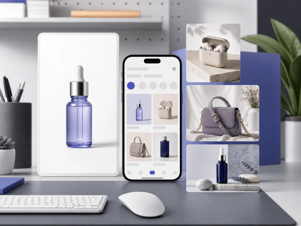
AI product photography for TikTok Shop can help you launch listings faster, but careless visuals can cost you review delays, weak clicks, and buyer doubt. TikTok Shop is visual-first: your main image must explain the product instantly, and your supporting images must feel natural next to creator content. This guide shows how to build a compliant, mobile-ready image workflow with clean hero photos, honest lifestyle shots, and Pixora Smart Presets that do not require prompt engineering.
Why Do TikTok Shop Product Photos Need a Different Workflow?
TikTok Shop product photos need a different workflow because the listing does not live in a quiet catalog. It sits inside a fast, mobile, creator-led buying environment where shoppers decide quickly whether the product feels clear, real, and worth tapping. A photo that works on a desktop Shopify page may look dull in a TikTok Shop thumbnail. A dramatic social post may fail as a listing hero because it hides the product behind props, models, or heavy styling.
The first risk is compliance. Seller guidance and current marketplace best practices point toward square product images, clean main-image presentation, no misleading overlays, and enough image variety to show different angles or use cases. If your main image is cluttered, low-resolution, non-square, or visually confusing, you lose time before the product even has a chance to sell.
The second risk is trust. TikTok buyers often arrive from short-form video, creator content, or affiliate recommendations. If the listing photos look unrelated to the product they just saw, confidence drops. If AI changes the shape, label, texture, or color of the item, you are not improving the listing. You are creating a return risk.
That is why the best workflow is not "make everything look expensive." It is "make the product easy to understand in one second, then make ownership easy to imagine." AI helps when it speeds up that system: a clean white-background hero, sharp detail images, and supporting lifestyle frames that match the product without inventing a fantasy version.
What Should the Main TikTok Shop Image Show?
The main TikTok Shop image should show the product clearly, centered, and without visual noise. Treat it like the image that protects your listing from confusion. A square crop is the safest default because TikTok Shop listing images are commonly presented in a square format, and many seller guides recommend at least 800 x 800 pixels, with higher resolution preferred for sharper mobile viewing.
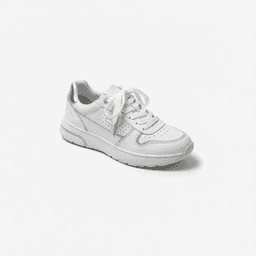
Keep the first image conservative. Use a white or very light neutral background, remove props that are not included in the sale, avoid promotional text, and make sure the product fills enough of the frame to be recognizable in a small thumbnail. If the item is sold as a set, show the real set. If packaging matters, include it only when it is part of the purchase and does not make the product hard to identify.
This is where many sellers lose money without noticing. They reuse a lifestyle image as the hero because it looks pretty in full size, but the product becomes tiny once TikTok crops it. Or they use a supplier image that includes badges, foreign text, or multiple products that do not match the exact SKU. Every unclear hero image creates friction: fewer clicks, more questions, and weaker buyer confidence.
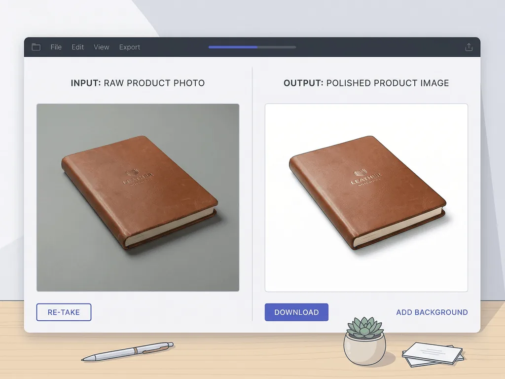
With Pixora, the white-background presets are the practical starting point. Fashion E-commerce Studio, Accessory Studio, Beauty Studio, Tech Studio, Food Menu Studio, and Home & Appliances Studio all support the same principle: isolate the real product, clean the background, keep the composition direct, and create a listing-ready first impression without asking the seller to describe lighting, crop, and background rules from scratch.
How Should Supporting Images Sell the Product on TikTok Shop?
Supporting images should answer the questions the main image cannot answer. The hero photo earns the tap. The rest of the gallery earns confidence. TikTok Shop shoppers need to understand scale, texture, use case, packaging, color accuracy, and why the item belongs in their routine.
Think of the image set as a short sales sequence. Image one identifies the product. Image two proves detail: fabric texture, bottle label, connector ports, stitching, finish, or ingredients. Image three shows scale or fit. Image four shows the product in a believable lifestyle context. Image five handles packaging, bundle contents, or a practical use case. If you have more slots, use them to show variants, angles, and creator-friendly scenes.
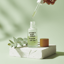
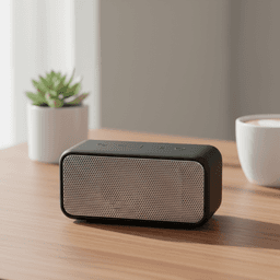
AI is especially useful for the images that are expensive to stage repeatedly. A skincare bottle can move from a clean white hero into a soft bathroom counter scene. A phone accessory can appear on a modern desk. A bag can be shown in an on-model context. A snack package can sit in a bright tabletop setting. The product remains the same, but each image gives the buyer another reason to trust the purchase.
The rule is restraint. Do not generate scenes that imply features the product does not have. Do not make a budget item look like it comes with luxury packaging if it does not. Do not hide product flaws that buyers need to see. The goal is a gallery that feels more complete, not more deceptive. When AI helps shoppers understand the real item faster, it supports conversion and reduces the chance of disappointed buyers.
What Makes AI Photos Look Native to TikTok Instead of Fake?
AI photos look native to TikTok when they feel clear, bright, and believable on a phone screen. TikTok is not a glossy catalog environment. It is built around immediacy. Overly polished scenes, impossible reflections, warped labels, and luxury props that do not match the product can make a listing feel fake even when the item is legitimate.
Start with a strong source photo. Shoot the product in focus, avoid harsh glare, keep edges visible, and use enough distance so the AI has the full object shape. For reflective or transparent items, use soft, even light. For clothing and accessories, show the structure clearly. For electronics, protect ports, buttons, screens, and logos. The AI output is only as trustworthy as the product information it receives.
Then choose image jobs that match TikTok behavior. For discovery traffic, you need fast recognition. For affiliate traffic, you need consistency between the creator video and the product page. For impulse purchases, you need low-friction proof: the item looks real, useful, and ready to arrive as shown. This is why white-background and lifestyle presets should work together instead of competing.
Pixora's Smart Presets help here because they reduce random creative drift. Instead of writing a long prompt like "clean mobile-first e-commerce product photo with soft shadows and realistic tabletop context," you choose a preset built for the category and add short notes only when needed. That keeps the output close to a commercial product-photo workflow rather than a generic AI art experiment.
Before-After-Bridge: From Supplier Photos to a TikTok-Ready Listing
Before: a seller imported a promising product and copied the supplier photos into TikTok Shop. The first image had a busy gray background, three product variants in one frame, and a small badge in the corner. The item looked fine on the supplier site, but on TikTok Shop it felt cheap and confusing. The seller was paying for samples, testing creators, and adjusting pricing, yet the listing photos were silently weakening every visit.
After: the seller rebuilt the gallery around a simple system. The main image became a clean square product shot on a white background. The second image showed the exact texture and finish. The third showed scale. The fourth showed the product in a realistic lifestyle setting that matched the creator content. The fifth clarified what comes in the box. Nothing about the product was exaggerated, but everything about the presentation became easier to trust.
The bridge was not a studio day or a complicated design tool. It was one honest source image and a preset-based AI workflow. The seller used a clean studio preset for the hero, then a category lifestyle preset for secondary images. User notes handled small brand preferences, such as warmer light or a neutral desktop, without turning the process into prompt engineering.
That is the practical promise of AI product photography for TikTok Shop. You can move from messy inherited assets to a gallery that looks intentional, mobile-ready, and consistent with how shoppers actually buy, without losing weeks to reshoots.
How Does Pixora Fit a TikTok Shop Seller Workflow?
Pixora fits a TikTok Shop seller workflow when you use it as a repeatable image production system. Start with the listing requirement: one clean product-first hero image, then supporting images that answer buyer questions. Pick the preset that matches the image job, upload the real product shot, add optional User Notes for brand mood, and generate variations in seconds.
For fashion and accessories, Fashion E-commerce Studio creates clean catalog-style hero images, while Fashion Lifestyle: On-Model Photography and Accessory Lifestyle: On-Model Context help with fit and scale. For beauty sellers, Beauty Studio supports main images, while Beauty Creative: Aesthetic Still Life and Beauty Texture: Macro Swatch & Detail create stronger secondary proof. For electronics, Tech Studio and Tech Lifestyle handle clean product views and modern-use context. For food, Food Menu Studio and Food Editorial support package clarity and appetizing tabletop scenes.
This topic has a Business Potential Score of 3 for Pixora. TikTok Shop sellers need speed, compliance-aware structure, and visual variety, but many do not have the time, budget, or editing skill to create fresh listing images for every SKU. Smart Presets solve that exact production problem without forcing sellers to become photographers or prompt engineers.
The honest positioning matters: Pixora does not remove the need for accurate product information. It helps you present the real product better. Use it to clean the hero, strengthen supporting images, and keep visual style consistent across SKUs. That is where AI becomes a sales asset instead of a risk.
Where TikTok Shop Sellers Lose Sales With Photos
The main image is cluttered, non-square, or too small to understand in a mobile thumbnail
Supplier images include badges, text, variants, or backgrounds that do not match the exact SKU
Lifestyle images look disconnected from creator videos and buyer expectations
AI changes labels, colors, proportions, or product details that must stay accurate
The TikTok Shop Photo Benchmarks
1:1
Safe square format for listing images and mobile thumbnails
800 px+
Common minimum resolution target cited by current seller guides
9 slots
Useful gallery capacity for showing angles, context, scale, and packaging
Turn One Product Shot Into a TikTok-Ready Gallery
Use Pixora Smart Presets to create a clean hero photo, detail images, and lifestyle frames from real product shots without writing prompts.
Create a square, product-first image with a white or light neutral background, no overlays, and enough product fill for a mobile thumbnail.
A clearer first impression that supports review and click-through.
02
Map the Gallery Jobs
Assign each secondary image a role: detail, scale, use case, packaging, variant, texture, or creator-aligned lifestyle context.
A gallery that answers buyer questions instead of repeating the same angle.
03
Generate and Audit
Use Pixora presets for each image job, then check labels, colors, shape, bundle contents, and visual honesty before publishing.
Faster TikTok Shop visuals that stay accurate to the real product.
TikTok Shop AI Photo Checklist
The first image is square, sharp, centered, and easy to read on mobile
No promotional text, watermarks, decorative borders, or unrelated props appear on the hero
The product color, label, geometry, and included contents are unchanged
At least one secondary image shows scale, texture, fit, or real-world use
Lifestyle images match the product's actual price point, category, and buyer promise
What Improves With a Preset-Based TikTok Shop Workflow
You stop losing review time to avoidable image mistakes
Your listings look more consistent across SKUs and campaigns
Creator traffic lands on product pages that feel visually aligned
Buyers understand what they are getting before they message or return
You can refresh seasonal and affiliate assets without booking a shoot
Share this article
Create TikTok Shop Photos That Look Clear, Real, and Ready to Sell
Stop relying on supplier images or risky AI experiments. Start with a real product shot, choose a Smart Preset, and build a TikTok Shop gallery that earns buyer trust.
Yes, as long as the photos accurately represent the real product. Use AI to clean backgrounds, improve consistency, and create supporting context, not to change the item buyers will receive.
A square 1:1 image is the safest listing format. Many current seller guides recommend at least 800 x 800 pixels, with higher-resolution square images preferred for sharp mobile display.
A white or very light neutral background is the safest choice for the main image because it keeps the product clear and reduces review risk. Use lifestyle scenes for secondary images.
Use category studio presets for main images, such as Fashion E-commerce Studio, Beauty Studio, Tech Studio, or Accessory Studio. Use lifestyle presets for secondary images that show scale, use case, or mood.
Start with sharp real product photos, avoid fantasy backgrounds, protect labels and geometry, and choose scenes that match the product's actual use and price point.
Yes. You can upload a real product image and use different Smart Presets to create a clean hero image, detail-focused visuals, and lifestyle variations for the same SKU.