How to Photograph Furniture at Home and Stop Losing Sales
Furniture listings fail for one simple reason: buyers cannot touch scale, texture, or build quality through a screen. If your sofa looks too dark, your table legs look warped, or your white background is not truly white, shoppers leave. This guide shows how to shoot furniture at home, meet marketplace rules, and produce conversion-ready visuals in minutes.
Quick Answer: How to Photograph Furniture for Online Selling
To photograph furniture for online selling, use a level camera at product midpoint, soft side light, enough distance to avoid wide-angle distortion, and a repeatable shot list. Publish one clean white-background image for marketplace evaluation, one lifestyle room-context image for scale and desire, one straight-on angle, one side angle, and one or two material detail shots.
The fastest scalable workflow is to capture a clear source image, then generate channel-specific variants from it. Pixora's furniture presets support both jobs: Studio White Background for catalog and marketplace pages, and Lifestyle Interior for room-context images that help buyers understand scale, fit, and style.
Why Furniture Photos Break Trust Faster Than Other Categories
Furniture is high-consideration, high-ticket, and high-risk for buyers. A customer can forgive a weak photo for a ten-dollar accessory. They do not forgive uncertainty on a seven-hundred-dollar dining table. When image quality is weak, buyers start asking silent questions: Is the fabric rough? Is that oak tone accurate? Is this table actually sturdy or just styled well? Those questions delay checkout and increase returns.
Furniture also has a unique visual burden: scale. A chair can look premium in one frame and toy-sized in the next if perspective is off. A sofa can look elegant in real life but bulky online when photographed from a low phone angle. In practice, poor scale cues destroy confidence more than minor lighting errors.
Texture is the second trust trigger. Wood grain, brushed metal, velvet nap, and matte lacquer are the details that justify price. If compression, shadows, or over-editing flatten those materials, the listing feels generic. Shoppers compare five tabs in parallel, and the listing that feels most tangible wins attention.
Third is consistency across the catalog. If one product appears cool-toned, another warm, and a third with a different shadow direction, your store looks stitched together instead of curated. Inconsistent visuals imply inconsistent operations. For small brands, this is expensive because every image has to compensate for missing brand recognition.
Strong furniture photography is not about artistic perfection. It is risk reduction. Good images reduce buyer uncertainty, shorten decision time, and make your price feel justified. That is why this topic is a revenue problem, not a design hobby.
How to Photograph Furniture at Home Without a Warehouse Studio
You do not need a full studio to create usable source photos. You need controlled light, stable angles, and repeatable setup rules. Start with location. Choose the largest uncluttered wall in your space and pull furniture one to two meters away from the background so you can separate subject and wall. This gives cleaner edges and reduces harsh wall shadows.
Use window light first. Position the main light at about forty-five degrees to the furniture front. If the shadow side gets too dark, place a white foam board opposite the window to bounce light back. This simple setup gives soft dimensionality without expensive modifiers. Avoid mixed lighting whenever possible. Daylight plus warm ceiling bulbs creates color inconsistency that is hard to correct later.
For camera position, keep lens height near the product midpoint. For a sofa, shoot around seat-back center. For a cabinet, shoot around handle height. This protects vertical lines and avoids the distorted "leaning" effect. Step back and use a mild zoom rather than standing too close with a wide lens. Wide angles exaggerate front edges and shrink rear depth, which misrepresents dimensions.
Capture a repeatable shot set for every SKU: front three-quarter hero, straight front, side detail, and one material close-up. This structure supports product pages, marketplaces, and social crops without reshoots. Keep at least one frame with generous negative space for promotional overlays.
Before ending the session, check detail sharpness at full zoom. Confirm stitching lines, grain direction, and hardware edges are clean. A technically honest source image is the most important input for any later enhancement workflow.
What Are the Exact Image Requirements for Amazon, Shopify, and Etsy?
If you sell across platforms, your workflow must follow the strictest common denominator. Start with this baseline: keep your highest-resolution master files, then export channel-specific variants. This prevents repeated compression loss and gives flexibility for new placements.
For Amazon main images, the product should dominate the frame and the background must be pure white for compliance-sensitive categories. For Shopify, product pages perform best when image dimensions support zoom clarity, and Shopify guidance commonly centers around high-resolution square assets such as 2048 by 2048 pixels. Etsy listing guidance emphasizes large, clear images with the shortest side at or above 2000 pixels for quality display across devices.
Even when rules look simple, failures happen in three places. First, backgrounds that are almost white instead of true white. Second, crops that trim legs, corners, or handles. Third, exports that are too compressed for detail-heavy materials. These issues lower trust before price is even evaluated.
Use a platform checklist before publishing. Verify background, framing, dimensions, and color neutrality. Then spot-check a few listings on mobile because many shoppers compare options on small screens. If grain and hardware remain legible on mobile, your desktop version is usually strong enough.
The practical takeaway is straightforward: compliance and clarity are not separate goals. The same disciplined image system that prevents suppression also improves conversion quality.
How Do You Avoid Scale and Perspective Mistakes on Large Items?
Scale confusion is the top reason furniture photos feel deceptive even when they are technically sharp. The fix is to give the eye reliable reference points while preserving clean composition. One method is controlled contextual framing: include subtle floor contact, baseboards, or wall lines so buyers can estimate size naturally. A floating subject on a blank field can look premium, but if every image floats, shoppers cannot judge real-world footprint.
Perspective errors usually come from camera height and tilt. If the camera is too low, sofa arms look oversized and backrests recede unnaturally. If too high, tops flatten and depth collapses. Keep the camera level and use grid lines to align vertical edges with the frame. Small angle discipline creates a major trust gain at catalog scale.
Lens choice matters more than most teams expect. Wide smartphone equivalents are useful in tight spaces, but they bend edges near frame boundaries. When possible, move back and crop in slightly. This preserves geometry and keeps proportions honest.
For reflective or glossy furniture, watch highlight placement. Uncontrolled hotspots on lacquered surfaces can hide defects or mimic defects that do not exist. Diffuse light and test one dark and one light object before full production. If both retain shape and texture, the setup is balanced.
Finally, standardize your shot distance bands by product type. For example: dining chairs at two meters, coffee tables at two and a half, large sofas at three or more. When each category follows consistent distance rules, your catalog reads as intentional and professional, not improvised.
Before-After-Bridge: From Chaotic Product Pages to a Cohesive Storefront
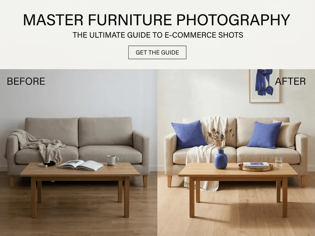
Before: a small furniture brand had solid products but inconsistent visuals. Some SKUs were shot near a yellow wall, others under cold overhead lights. White backgrounds varied between gray and blue. Dimensions were correct in text, yet customers still messaged basic size questions because photos felt unreliable. Returns were not catastrophic, but confidence was weak and ad traffic converted below expectations.
After: the same team rebuilt the process around a repeatable capture system and preset-driven post-production. They kept camera height consistent by product family, captured a fixed set of angles, and published two visual intents per SKU: a clean marketplace-first image and a styled lifestyle context image. Product pages started looking like one brand, not twenty random shoots. Support questions about color and scale dropped, and merchandising teams could launch new items faster because the workflow no longer depended on perfect shoot conditions.
Bridge: the turning point was not buying expensive gear. It was removing decision fatigue from the process. With Pixora, they used Home & Appliances: Studio White Background for compliant first images and Home & Appliances: Lifestyle Interior for context-rich secondary assets. Smart Presets handled lighting consistency and scene quality while the team focused on assortment and pricing decisions.
The broader lesson applies even if your stack differs: transformation comes from systems, not one-off edits. Document your angle rules, naming rules, and export rules. Then apply them every time.
How Pixora Smart Presets Fit a Practical Furniture Workflow
A practical workflow for furniture teams has three outputs: compliance-ready hero image, trust-building detail shots, and lifestyle context for persuasion. Pixora maps directly to that structure without prompt engineering.
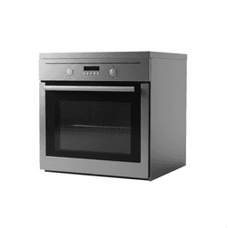
Start with Home & Appliances: Studio White Background when you need clean listing images for marketplaces or catalog uniformity. Upload your source photo, keep user notes short, and request subtle grounding shadow if needed. This preset is useful when you must move fast across many SKUs while preserving material fidelity.
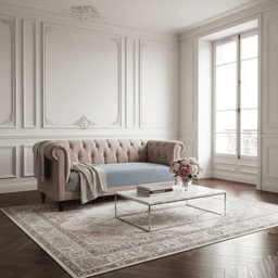
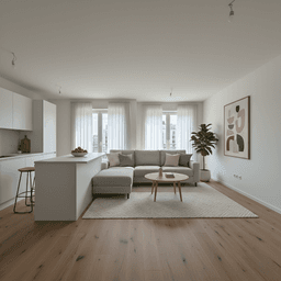
Then create secondary visuals with Home & Appliances: Lifestyle Interior. This places furniture in a realistic room context and helps buyers understand scale and fit. Use user notes to specify style direction such as "minimal Scandinavian living room" or "warm modern apartment". You keep control over aesthetic direction without writing technical prompts.
If you sell spaces as well as products, Real Estate: Virtual Staging & Furnishing can support campaign visuals where room storytelling matters. The key is matching asset type to buyer intent: white background for evaluation, lifestyle context for imagination.
Keep the workflow disciplined. Generate a small test batch first, review on desktop and mobile, then roll through the full catalog. Save the winning notes pattern for each category and reuse it. That is how teams move from occasional good images to consistently high-converting visuals with lower production effort.
Why Furniture Sellers Get Stuck
Large products are hard to shoot in small spaces without perspective distortion
Cross-platform requirements create rework when files are exported ad hoc
Inconsistent lighting across SKUs makes the storefront look unprofessional
Manual editing time scales badly as catalog size grows
Furniture Image Economics
$1,700+
Typical upper-end cost of one traditional product photo session
2048 x 2048
Common Shopify recommendation for zoom-friendly product images
2000 px
Etsy listing quality baseline for the shortest image side
Use Your Existing Furniture Photos
Upload one real product image and test Studio White plus Lifestyle Interior presets. Compare output quality before scheduling another costly shoot.
Photograph each SKU with consistent camera height, controlled window light, and at least four repeatable angles.
Reliable source files that preserve dimensions, texture, and color.
02
Generate Two Asset Types
Create a compliance-ready white background hero and a lifestyle context image for persuasion-focused placements.
Channel-ready visuals that match both marketplace rules and brand storytelling goals.
03
Publish with Platform Checks
Validate dimensions, crop safety, and material clarity on both desktop and mobile before launch.
Fewer listing issues, stronger trust signals, and faster SKU rollouts.
Pre-Publish Furniture Image Checklist
Main image uses a true white background where marketplace policy requires it
Vertical and horizontal lines are straight with no obvious lens warping
At least one close-up confirms texture quality for wood, fabric, or metal
Color looks neutral across desktop and mobile screens
Each SKU includes both compliance and lifestyle variants
What Improves When Your Image System Is Repeatable
Higher buyer confidence for high-ticket furniture purchases
Faster catalog launches without ad hoc editing bottlenecks
Lower risk of compliance issues on strict marketplaces
Better visual consistency across your entire storefront
Reduced dependence on expensive external photoshoots
Share this article
Build a Furniture Catalog That Looks Trustworthy at First Glance
You already have the products. Now make every listing communicate quality, scale, and confidence. Start with a real SKU, test Smart Presets, and publish channel-ready visuals today.
Yes. A modern phone with stable lighting and correct camera height can produce strong source images. The key is perspective control, sharp detail, and consistent shot distance by product type.
For compliance-sensitive channels, use a workflow that keeps backgrounds pure white, the product fully visible, and framing clean. Always run a final channel check before publishing.
A front three-quarter angle at product midpoint is usually the most reliable because it shows depth and structure without exaggerating edges. Pair it with one straight-on image for dimensional clarity.
A practical baseline is four to six images: one compliance hero, one lifestyle context frame, one straight front, one side, and one or two close-ups for material details.
Quality workflows are designed to preserve material identity while improving presentation. You should still review output on multiple screens to confirm color accuracy before launch.
No. Smart Presets are built for click-first workflows. You can optionally add short user notes for style direction, but technical prompting is not required.