How to Create WooCommerce Product Photos That Make Your Store Look Ready to Buy From
A weak WooCommerce product photo does more than look unfinished. It makes the whole WordPress store feel risky, slows trust, and gives shoppers a reason to compare you with a larger brand. This guide shows how to build a repeatable image system for WooCommerce using clean source photos, smart sizing, and AI presets that help you publish faster without turning every launch into a photo project.
Why Do WooCommerce Product Photos Affect Trust So Quickly?
WooCommerce gives founders control, but that control creates a higher visual burden. A marketplace listing borrows trust from the platform. A WooCommerce store has to earn trust on its own, and product photography is often the first proof a shopper sees. If the gallery looks dim, inconsistent, or stretched by the theme, the product starts feeling uncertain before the copy can help.
The risk is bigger for small brands because buyers already know how polished larger stores look. A handmade skincare line, electronics accessory shop, or fashion brand can have excellent products and still lose the click if thumbnails feel uneven. Shoppers do not usually say, "This image has weak side lighting." They simply feel less confident and move on.
Good product photos reduce that doubt. They make the product easy to understand, show material and scale, and create a clear visual rhythm across category pages. That rhythm matters in WooCommerce because themes, plugins, and image settings can all affect how photos appear in the grid, gallery, cart, and related-product modules.
The goal is not to create one dramatic hero image. The goal is to build a store-wide image system that makes every SKU look intentional. When your photos share consistent crops, clean lighting, and useful gallery roles, the store feels managed. That feeling can protect price perception, reduce hesitation, and make a small brand look more established than its production budget.
What Image Sizes Work Best for WooCommerce?
WooCommerce image sizing depends on your theme, but the practical rule is stable: upload a sharp master image that is large enough for zoom, then let WordPress create the smaller thumbnails. Recent WooCommerce image-size guidance commonly recommends square masters in the 1200 to 2048 pixel range, with 2048 by 2048 pixels giving more room for zoom and retina screens. Smaller images can work, but they leave less flexibility when themes crop, resize, or display products on high-density mobile screens.
Square images are the safest baseline for most product grids because they keep category pages tidy. That does not mean every visual must be a square studio shot. It means your main image should fit a predictable aspect ratio so the shop page does not jump between tall bottles, wide boxes, and cropped lifestyle scenes. Consistency keeps the store calm and easier to scan.
File weight is the other side of the decision. Uploading huge PNG files for every product can slow pages, especially on shared hosting or plugin-heavy WordPress installs. Keep high-resolution masters for editing, then publish optimized JPG or WebP files for most photos. Use PNG only when transparency or graphic edges truly matter.
A practical WooCommerce setup is simple: one clean square main image, three to five gallery images, and optimized exports that preserve detail without bloating the page. The technical settings support the business goal. Shoppers need images that are clear enough to inspect and fast enough that the store still feels responsive.
How Should You Shoot Source Photos Before Using AI?
AI product photography works best when the input photo is honest, sharp, and easy to read. Start with a clean source image rather than asking AI to rescue a chaotic shot. Put the product near indirect daylight, keep the camera level, and avoid mixed lighting from windows and warm ceiling bulbs. Mixed color temperatures make labels, fabrics, and finishes harder to preserve accurately.
Use a simple background during capture. A white table, poster board, or neutral wall is enough. You are not trying to build the final scene yet. You are trying to give the AI a clean view of the product edges, label, shape, and material. For glossy products, watch what reflects in the surface. Moving the product a few centimeters can remove a dark window reflection or phone glare that would otherwise distract from the final image.
Shoot a small set for every SKU: one front view, one three-quarter view, one close-up of the most important texture or feature, and one packaging or scale shot if your category needs it. Keep the height and distance similar across a category so the catalog feels consistent later. This is especially important for WooCommerce stores with many variations, because inconsistent source shots become obvious in product grids.
Before moving into Pixora, zoom in and check the practical details: readable labels, clean edges, accurate color, and no accidental props covering the product. The better the source, the more the AI can focus on background, lighting, and presentation instead of compensating for preventable capture problems.
What Photo Mix Converts Best on a WooCommerce Product Page?
A WooCommerce product gallery should answer buying questions in sequence. The first image needs instant clarity. It should show the product cleanly, with enough contrast and space that it reads well in a category grid, related-product carousel, and mobile product page. For many stores, that means a clean white or neutral background for the main image.
The next images should reduce uncertainty. Show a second angle, then a detail shot that proves texture, finish, ingredients, stitching, ports, scale, or packaging quality. These photos are not decoration. They help the shopper understand what they are buying without opening a support chat or abandoning the page to search for another seller.
Lifestyle photos work best after clarity has been established. A candle on a styled shelf, a watch in an everyday outfit context, or a desk accessory in a modern workspace helps the shopper imagine ownership. But lifestyle images should not hide the product or become so artistic that the buyer cannot judge color and shape. Mood supports conversion only when the product stays legible.
A strong WooCommerce gallery usually needs four to six images: one clean main image, one angle variation, one or two detail shots, one lifestyle or use-case frame, and one optional packaging or scale image. When each image has a job, the gallery feels persuasive rather than repetitive. You are not filling space. You are removing doubt.
Before-After-Bridge: From Plugin Chaos to a Cohesive Storefront
Before: a WooCommerce founder had a growing catalog but no repeatable photo workflow. Some SKUs used supplier images, some were shot on a phone, and some were edited manually after each launch. The theme cropped products differently across the shop page and product page. Nothing was broken, but everything felt slightly mismatched. Paid traffic arrived, clicked around, and hesitated because the store looked less mature than the products actually were.
After: the founder rebuilt the image system around a clear sequence. Every SKU received a square clean main image, a consistent second angle, a detail frame, and one context image. Source photos were captured with the same simple lighting setup. AI presets created the backgrounds and lifestyle variants, while WooCommerce received optimized exports that kept the grid consistent.
The bridge was not a larger studio budget. It was a repeatable decision path. Instead of asking, "What should this product photo look like?" every time, the founder asked, "Which gallery job does this image need to perform?" That shift removed creative fatigue and made launches easier.
This is the real advantage of AI product photography for WooCommerce. It does not replace your judgment as a merchant. It gives you a faster way to apply that judgment consistently. Your store starts looking like a planned brand rather than a collection of one-off uploads, and every new product becomes easier to publish.
How Does Pixora Fit a WooCommerce Workflow?
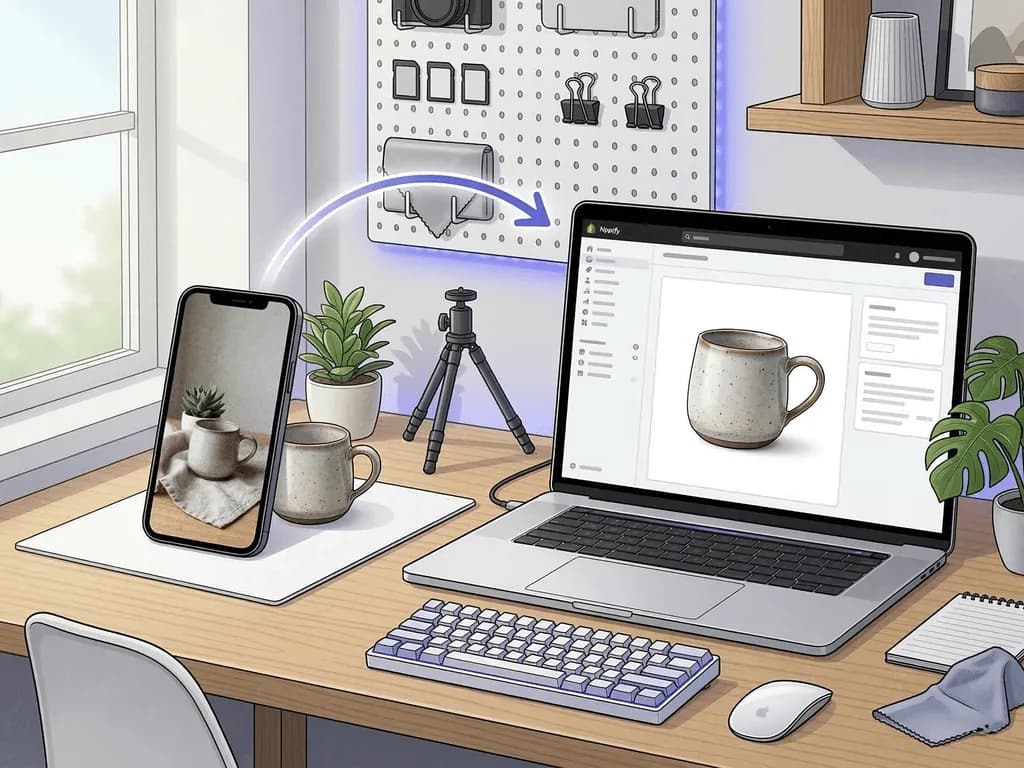
Pixora is useful for WooCommerce because store owners need repeatable image outcomes, not prompt-writing sessions. Smart Presets turn common product photo jobs into structured choices. You upload a clean product shot, pick a preset that matches the gallery role, add short user notes if needed, and generate a store-ready variation in seconds.
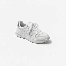
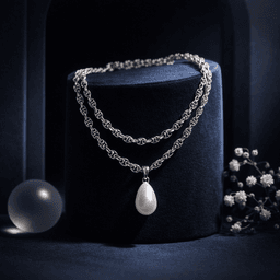
Use Fashion E-commerce Studio: Clean White Background when apparel, bags, or textile products need a clean main image. Use Tech Studio: Clean White Background for electronics and accessories that must show edges, finish, and ports clearly. Use Accessory Still Life: Aesthetic Display when you need a premium secondary image for jewelry, watches, eyewear, packaging, or giftable products.
The important point is to match the preset to the job. Your first WooCommerce image should usually prioritize clarity and grid consistency. Your middle images should prove details. Your lifestyle frame should create desire after the buyer understands the product. Pixora helps you create that mix without staging a new scene for every SKU.
You can still keep control. User Notes let you guide tone in plain language, such as "warm natural light," "minimal neutral background," or "premium holiday gift feel." The preset handles the photography logic while your note steers the brand mood. That balance is practical for WooCommerce founders who need professional images but cannot afford to slow every launch for manual editing.
Why WooCommerce Stores Struggle With Product Images
Theme crops and thumbnail settings make inconsistent product photos look even more uneven
Supplier images, phone shots, and manual edits create a patchwork catalog that lowers trust
Large files can slow WordPress pages while over-compressed files make products look cheap
Traditional photoshoots are too slow for frequent product launches, variants, and seasonal updates
The WooCommerce Image Math
1200-2048px
Practical square master range for clear WooCommerce product images and zoom
$9.90
Monthly Pixora Pro price compared with a far higher studio reshoot cost
4-6
Useful product gallery image count for clarity, detail, and context
Turn One Clean Product Shot Into a WooCommerce Gallery
Use Smart Presets to create a clean main image, a detail-friendly variant, and a lifestyle frame before scheduling another manual shoot.
Shoot the product in soft light with a simple background, stable camera angle, and readable product details.
A clean source file that gives AI enough truth to preserve shape, label, and material.
02
Generate Images by Gallery Role
Use a clean preset for the main image, a detail-focused version for confidence, and a lifestyle preset for context.
A product gallery where every image answers a buying question.
03
Publish Optimized WooCommerce Exports
Keep your master files, then upload compressed JPG or WebP versions with consistent crop logic and filenames.
A faster, cleaner store that looks consistent across grids, product pages, and mobile views.
Pre-Publish WooCommerce Image Checklist
The main image is clear in a shop grid and not only on the product page
Every SKU in the category follows the same crop and angle logic
The gallery proves at least one material, scale, or feature detail
Lifestyle images add desire without hiding the actual product
Published files are optimized for speed while preserving zoom-worthy detail
What Improves When WooCommerce Images Become a System
Category pages feel calmer, more premium, and easier to scan
Product pages answer buyer doubts before support questions appear
New SKUs launch with less manual editing and less visual drift
Paid traffic lands on a store that feels consistent with the ad promise
A small WordPress store starts looking like a serious brand
Share this article
Make Your WooCommerce Store Look Built to Sell
Stop losing trust to uneven product photos. Upload one real SKU, choose a Smart Preset, and create a WooCommerce-ready image set with the speed of AI and the structure of a professional workflow.
A practical baseline is a square master image between 1200 and 2048 pixels wide. Use the larger end when you want better zoom and retina clarity, then publish optimized files so the store stays fast.
Square images are the safest default for most WooCommerce grids because they prevent uneven thumbnails and awkward cropping. Some lifestyle images can use other ratios, but the main catalog image should follow a consistent format.
Four to six images is a strong starting point: one clean main image, one alternate angle, one or two detail shots, and one lifestyle or use-case image. Add more only when each image answers a real buying question.
Yes. AI-generated product images can be exported like regular image files and uploaded to the WordPress media library or WooCommerce product gallery. The key is to keep crops, file sizes, and gallery roles consistent.
Fashion E-commerce Studio: Clean White Background, Tech Studio: Clean White Background, and Accessory Still Life: Aesthetic Display are useful starting points. They cover clean main images, product clarity, and premium secondary visuals.
No. Pixora uses Smart Presets, so you choose a visual direction instead of writing technical prompts. You can add short user notes for brand nuance, but prompt engineering is not required.